
In my last blogpost A first look at Sitecore XM Cloud BYOC I gave a first look at Sitecore XM Cloud BYOC. In there I talked about how Sitecore uses React JSON Schema Form (which is a powerful library that simplifies the process of building dynamic forms in React applications. It leverages the JSON Schema standard, allowing developers to define the structure and validation rules of forms using a JSON-based schema) and the uiSchema to build out the UI in Sitecore Pages so content authors and marketers can configure data for a BYOC component in a visual way.
In today’s blogpost I would like to dive a bit deeper in what field types we can use in the declarative JSON syntax in our BYOC components, what UI additions we can make to have it visually displayed differently and in the end how it renders out in the BYOC components’ configuration section on the right-hand side in Pages.
Scaffold new BYOC component
In order to demonstrate all the various options we have let’s first scaffold a new BYOC component, we do that through the following command:
This above command will create an ‘example implementation’ of a BYOC component immediately in the correct ‘byoc’ folder in your front-end solution. When we import it and view it in Sitecore XM Cloud Pages we see the following:
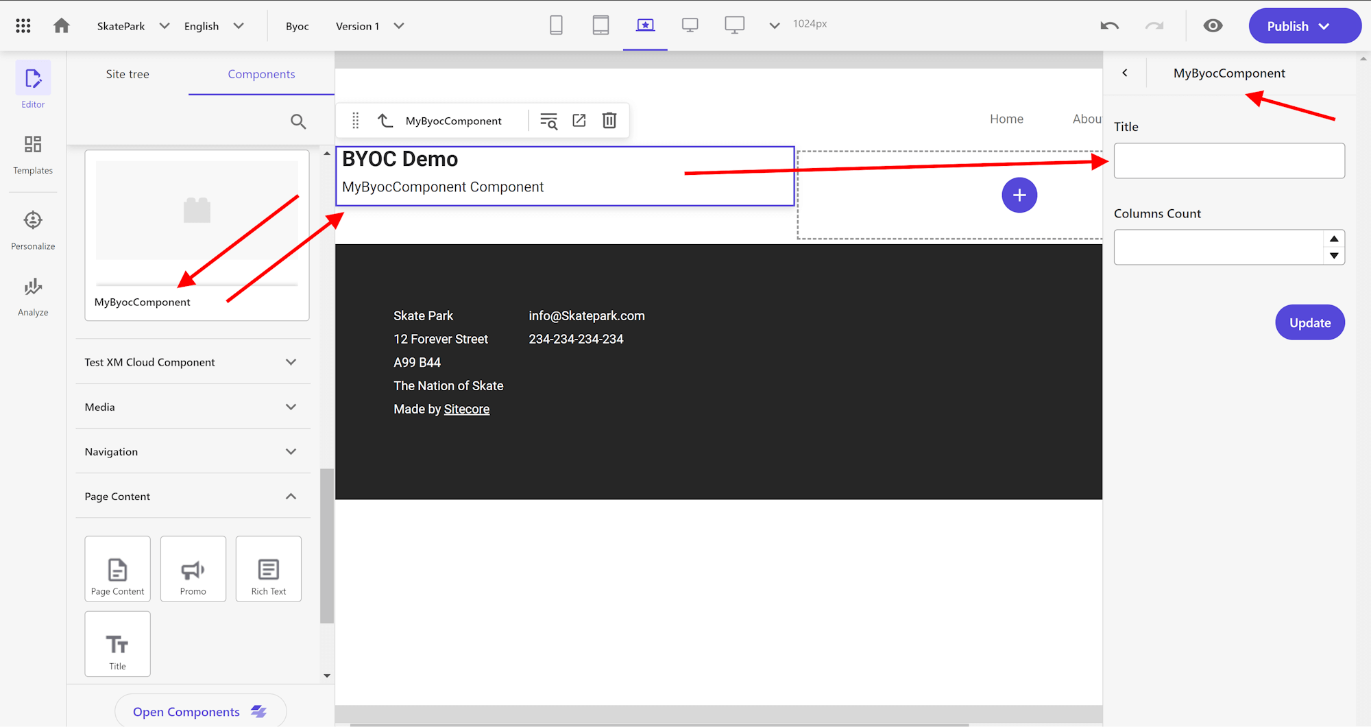
So the following code:
renders out the ‘title’ as a ‘textbox’ with the label of ‘Title’ and the ‘columnsCount’ as a ‘numeric textbox’ with the label of ‘Columns Count’, so something is happening there either by Sitecore or by the JSON Schema.
Title keyword
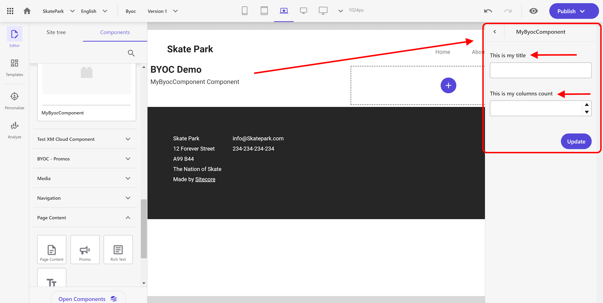
Titles can be specified by the ‘title keyword’ in the schema. The title can also be overridden by the ‘ui:title keyword’ in the uiSchema. We can have a little bit more control over the title by adjusting it to the following:
By adding the ‘title keyword’ there it will display like this:
Description keyword
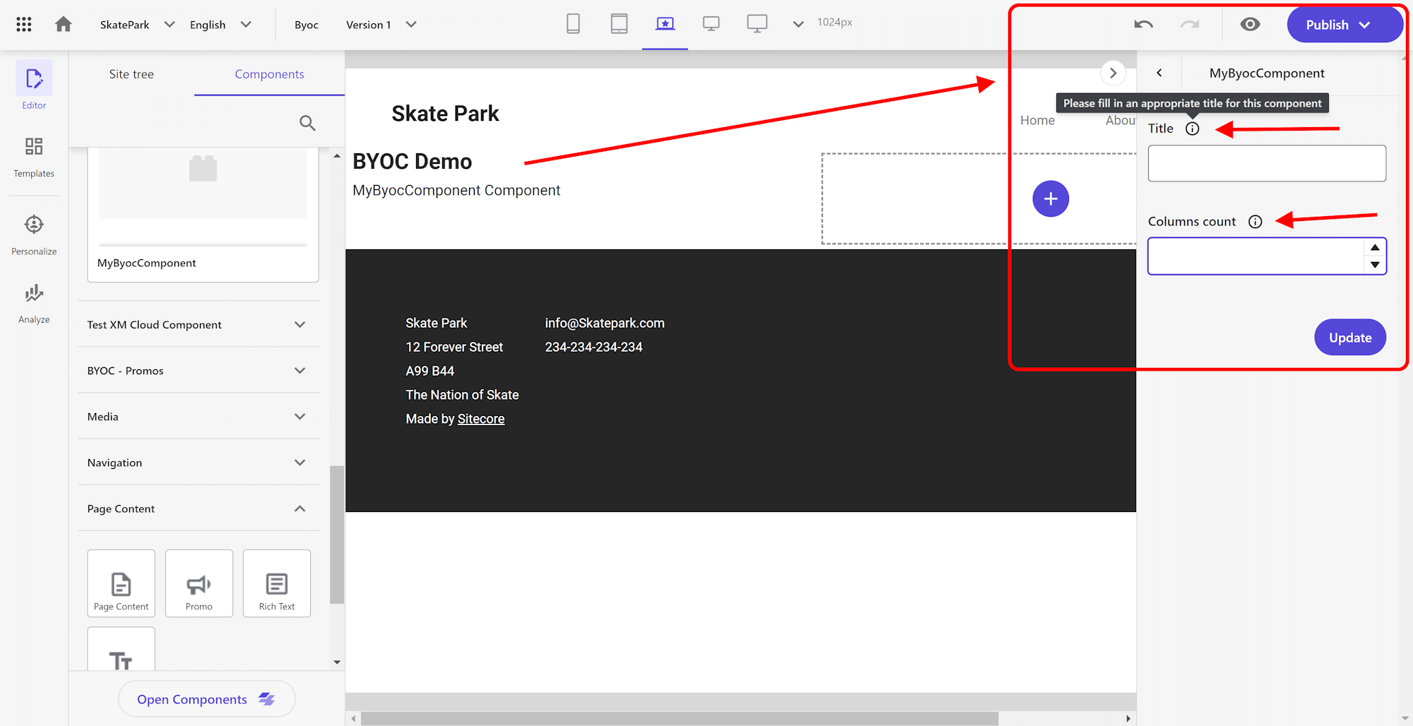
Like titles also descriptions can be specified by the ‘description keyword’ in the schema. The description can also be overridden by the ‘ui:description keyword’ in the uiSchema. The ‘description keyword’ is available where we can configure a ‘hint/description’ that will render out after the label.
Configure it like this:
It will then render in the UI like an ‘information icon’, where you can hover over to display the description:
Field placeholder text
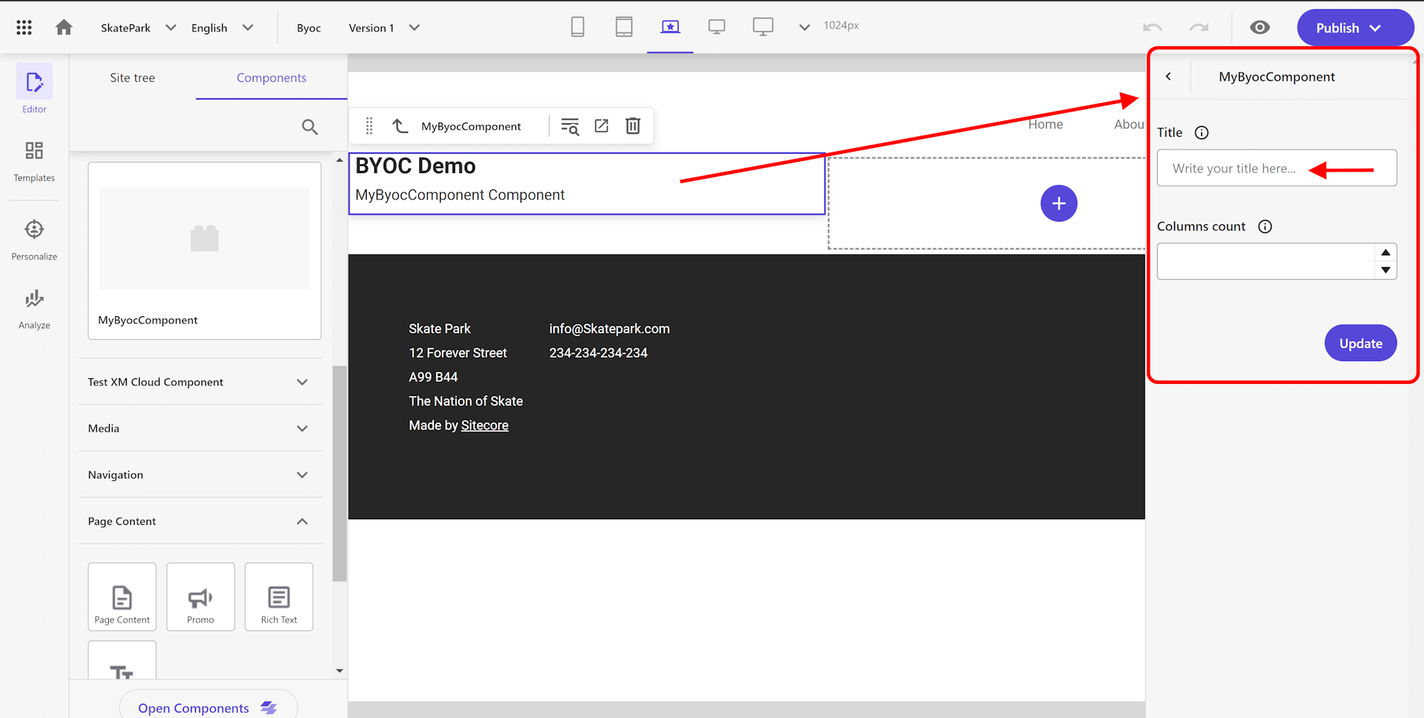
For certain fields we can define ‘placeholder text’ that will be displayed inside the rendered field. We have to define this in the root ‘UI property’. Let’s configure some placeholder text for the ‘Title’ field like this:
It will then render in the UI like this:
Dropdown UI
So let’s make some changes to the fields. Let’s use the ‘title’ field for this by for allowing to let the user select from a list of ‘salutations’. We can add an ‘enum property’ for this with an array of string values:
It will then render out in the UI like a ‘dropdown’ field:
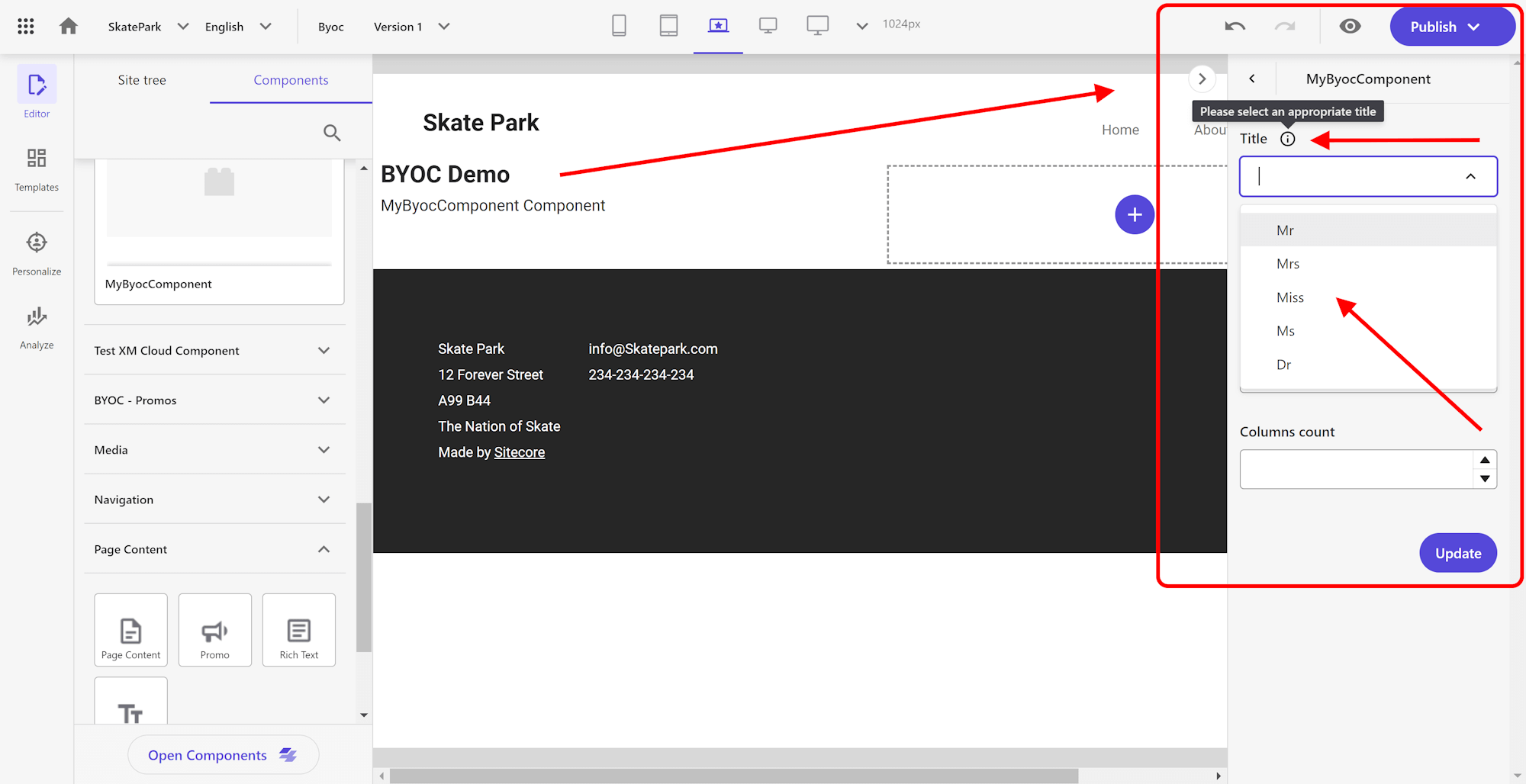
Multi-select dropdown UI
In the above dropdown, only one value in the dropdown can be selected. The JSON Schema also allows for generating a multi-select dropdown. Let’s add a property of type ‘array’ that allows for multi selecting of values. Arrays are defined with a type equal to array, and array items’ schemas are specified in the items keyword. Since we want to allow multiple values, we have to nest the ‘enum property’ as child of the the ‘items property’ like this:
It will then render out in the UI like a ‘multi-select dropdown’ field:
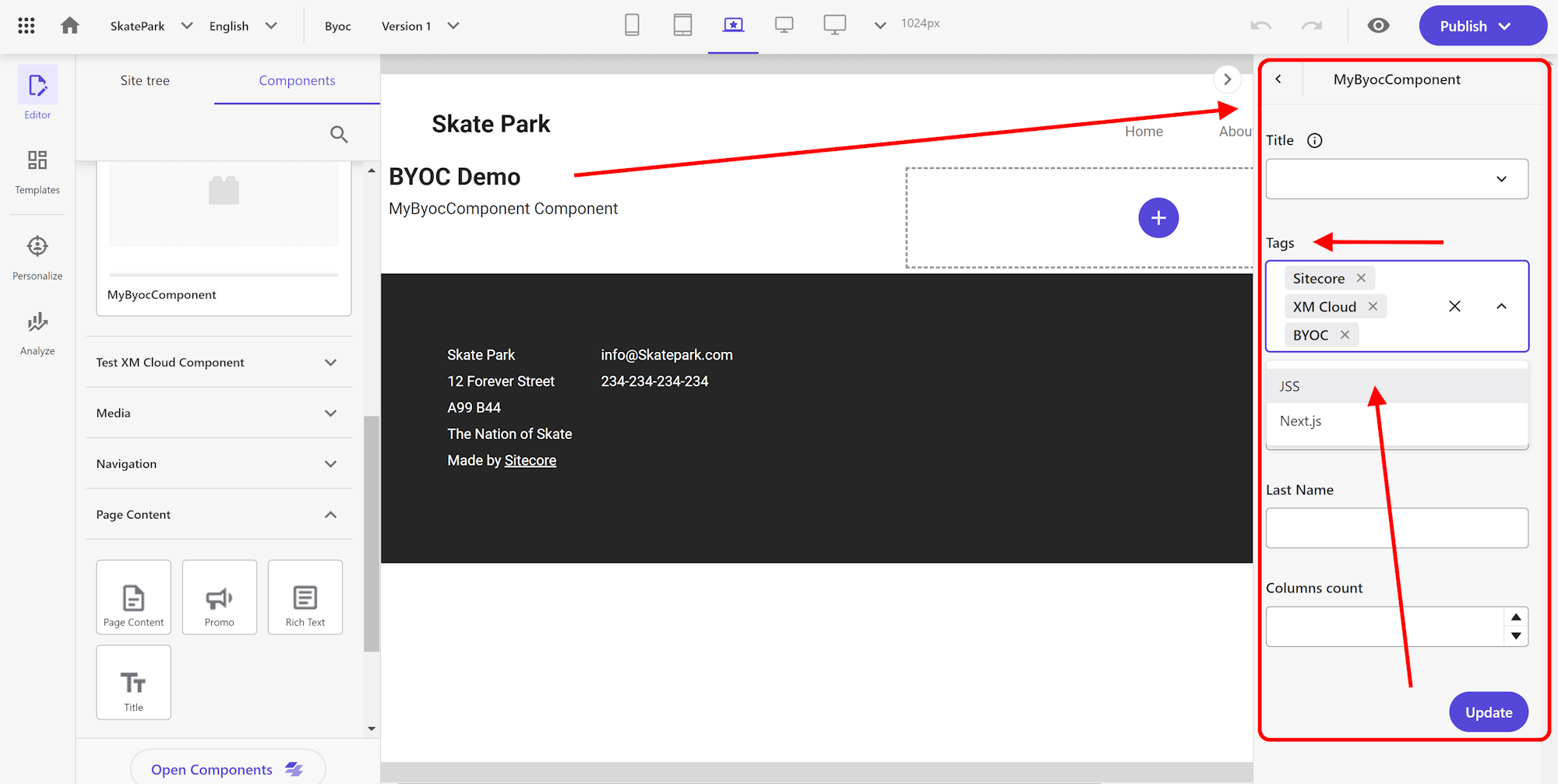
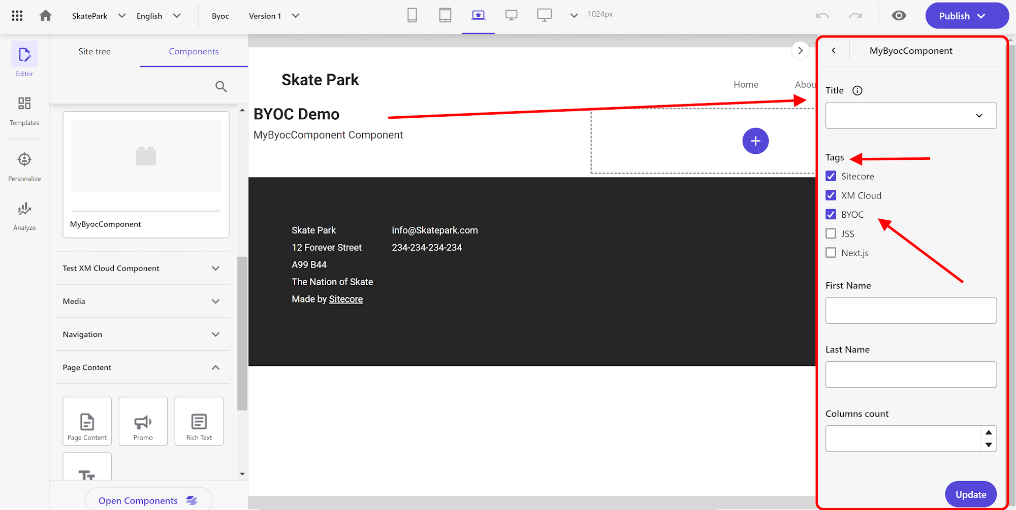
Multi-select checkboxes UI
In the above we showed the ‘Tags’ in a multi-select dropdown. Through the ‘uiSchema’ options, we can for example also display this differently to the end user. The only things we then need to do is adding a ‘ui:widget property’ in the root ‘ui property’ like this.
It will then render out in the UI like as a number of checkboxes:
And that’s it for now. There’s so much more to explore and so much more examples to potentially create, what I wanted is to get you started and show you one of the most used configurations.
Make sure to explore it some more yourself:
- https://rjsf-team.github.io/react-jsonschema-form/docs/json-schema/
- https://rjsf-team.github.io/react-jsonschema-form/docs/api-reference/uiSchema/
- https://rjsf-team.github.io/react-jsonschema-form/
If you haven’t checked out my previous blogpost on BYOC: check out: A first look at Sitecore XM Cloud BYOC, in one of the future blogpost I will for sure go into some more advanced scenarios. I have some great ideas in mind 😉
Happy Sitecore-ing!
–Robbert
