As some of you might NOT be aware, but Sitecore XM Cloud offers a multitude of possibilities of how to develop components that are compatible with XM Cloud.
- The first and most known way is by developing Next.js/JSS components.
- The 2nd one is by creating components through the Components Builder, the FEaaS application which allows an XM Cloud content author to build their own low-code/no-code components through a drag and drop interface.
- The 3rd option is to build BYOC (Bring your own components) components.
In this blogpost I want to take a first look at the 3rd option: BYOC components. What does BYOC offer? How does it technically work?, and I want to explore what the benefits and limitations are. Let’s go!
What is BYOC?
BYOC, or Bring Your Own Components, is a transformative feature within XM Cloud that empowers developers to seamlessly integrate their own React or web components into the platform’s interface. This innovative workflow enables developers to design, align, and style components within XM Cloud, expanding its capabilities and fostering creativity.
BYOC Features
With BYOC, developers can enjoy numerous advantages, including the seamless integration of custom components into the XM Cloud interface, real-time updates during development via hot reloading, and the flexibility to create components using their preferred tools and techniques.
Additionally, BYOC promotes reusability, allowing components to be easily shared and deployed across multiple XM Cloud sites.
SXA Starter Kit Promo vs BYOC Promo
In order to best demonstrate the differences, I’m going to first show you how I’m using the out of the box Promo component that comes with the SXA Starter Kit project when we use the xmcloud-foundation-head repo template to setup our repo, then I’m going to implement it the BYOC way and show what the differences are compared to the Next.js/JSS implementation.
So I cloned the xmcloud-foundation-head repo, ran the Init.ps1 script and then started the containers. After that I created the SkatePark headless site and installed the Basic Site module, so we have a SkatePark website. Let’s create a BYOC page, add a Column Splitter component to the page and then add a Promo component to that page. It could look like this:
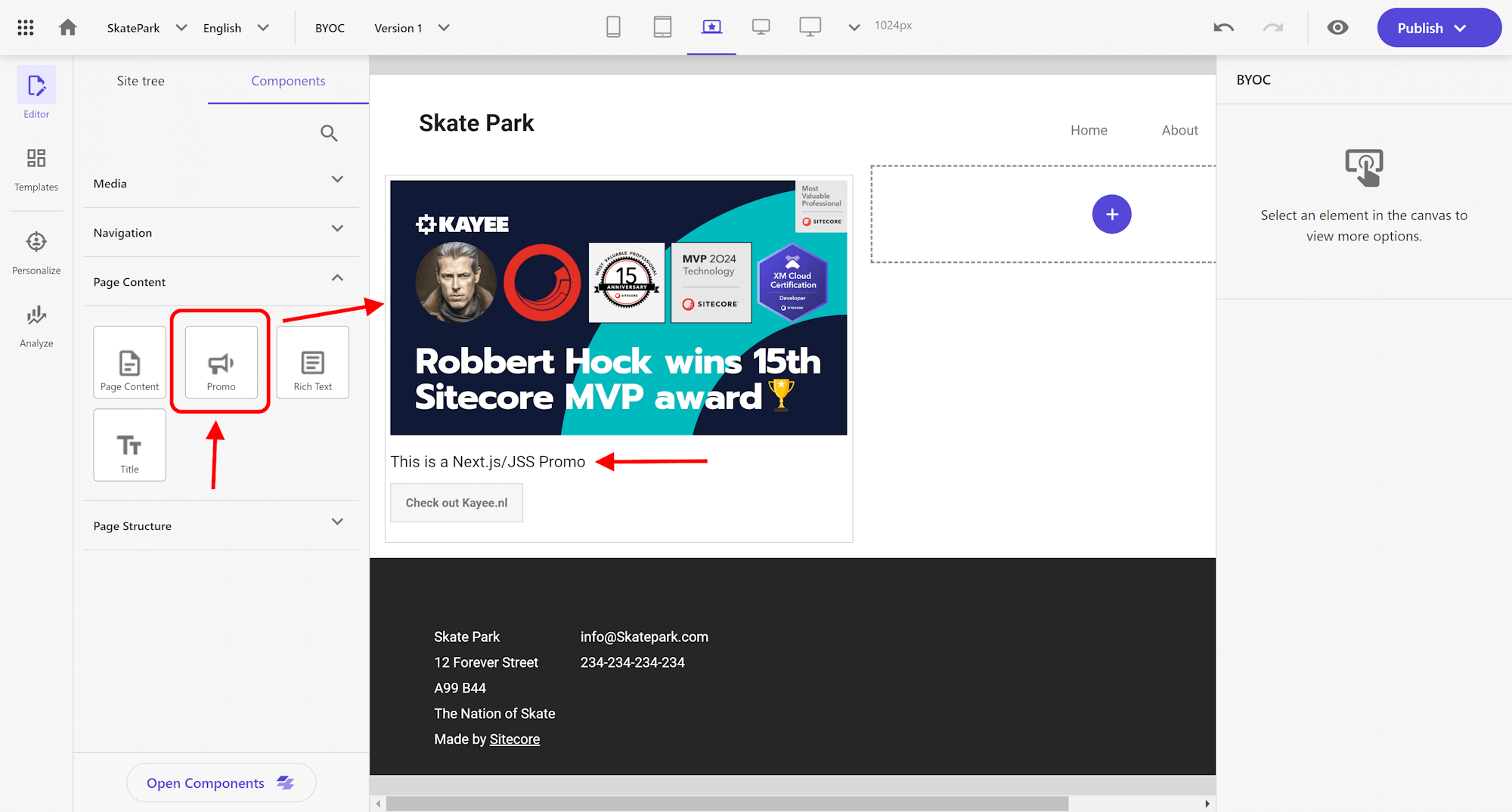
The benefits of Next.js/JSS components are that it offers ‘inline field editing’ in the Experience Editor and Pages, allowing each field to be edited inline and therefore styling can be configured for each individual field. Let’s for example select the ‘Text’ field, then you can immediately style it on the right hand side.
So with that in place, let’s now start implementing a BYOC component that looks exactly as the Promo component from the SXA Starter Kit. So when we open up the sxastarter front-end directory, we can now scaffold and auto-register our own components in a Next.js/JSS app.
So lets run the following:
the –byoc parameter will make sure that a BYOC component will be created. It will create the ByocPromo.tsx file in the src/byoc folder. The generated file contains a simple implementation and base registration logic. The FEAASExternal.registerComponent method allows the React component to be rendered as a Sitecore component (in Components and Pages) and therefore simplifying the integration process of normal React components and Sitecore.
Component Registration Parameters
Let’s have a look and explain what’s happening upon component registration. The FEAASExternal.registerComponent method takes various parameters:
component: This is the React component that will be rendered.
options.title: Specifies the name of the component as presented to the user.
options.properties: Defines the properties of the component using JSON Schema.
options.group (optional): Groups components in the UI for better organization.
options.thumbnail (optional): Provides a thumbnail image for the component in the UI.
options.isHidden (optional): Allows developers to hide the component from the UI if necessary.
options.ui (optional): Customizes the UI schema for tighter control over form widgets, styles, and behavior.
We can customize various aspects of the component registration, including default values for properties or UI options. Sitecore uses React JSON Schema Form for this, which is a powerful library that simplifies the process of building dynamic forms in React applications. It leverages the JSON Schema standard, allowing developers to define the structure and validation rules of forms using a JSON-based schema.
Sitecore also uses ‘uiSchema’, which is an optional companion to the JSON Schema. While JSON Schema defines the structure and validation rules of the field data, the ‘uiSchema’ specifies how the fields should be rendered and displayed to the user in the Pages interface.
The 2 schema’s can be found at:
- https://rjsf-team.github.io/react-jsonschema-form/docs/json-schema/
- https://rjsf-team.github.io/react-jsonschema-form/docs/api-reference/uiSchema/
There’s also a Live Playground you can play with:
BYOC Promo implementation
So in order to have the BYOC component mimic the html from the SXA Starter Promo component, we’ll grab that HTML and implement it in our BYOC component. As you can see in the original Promo component we need an Image, some Text and a button (which has a link and some button text), so we need properties for that.
This is how in the end the ‘Byoc Promo’ component will be implemented like:
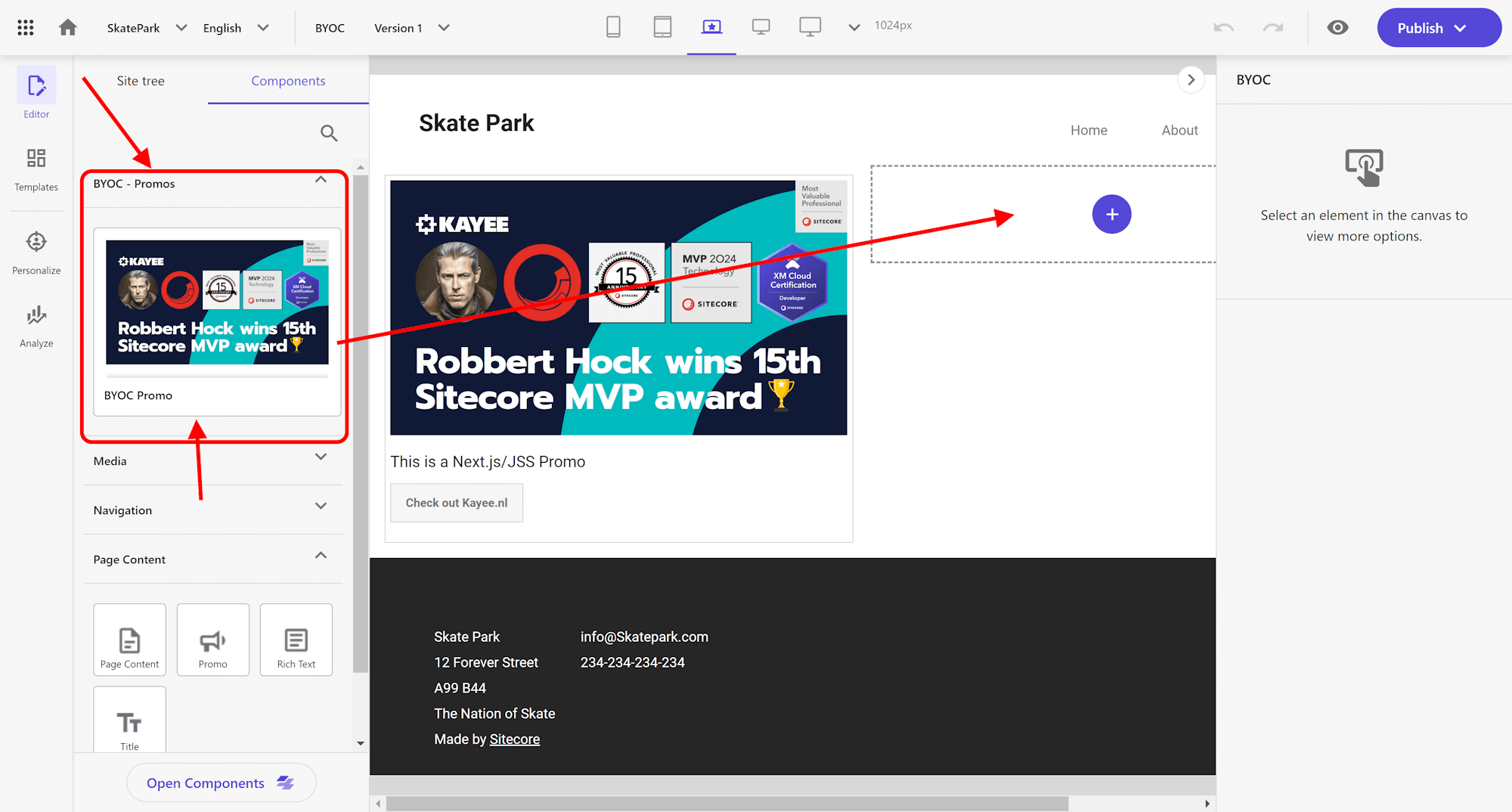
So now with the ByocPromo.tsx code completed we have to import the component into the following two files: index.client.tsx and index.hybrid.ts so it can be loaded into Pages.
With all that in place, we can now see it available in Sitecore Pages in the Components tab.
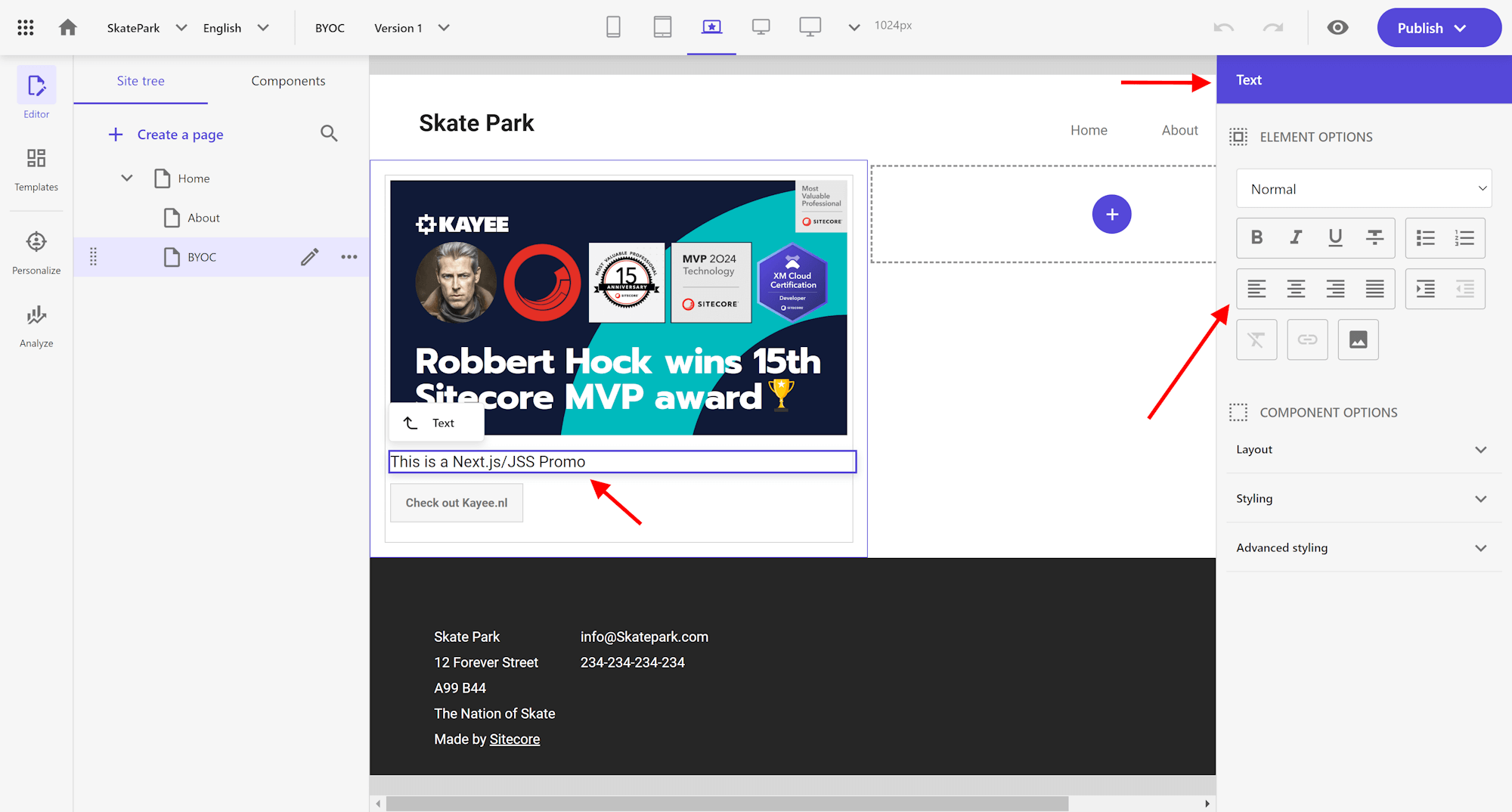
So now let’s drag and drop the ‘Byoc Promo’ component onto the 2nd column
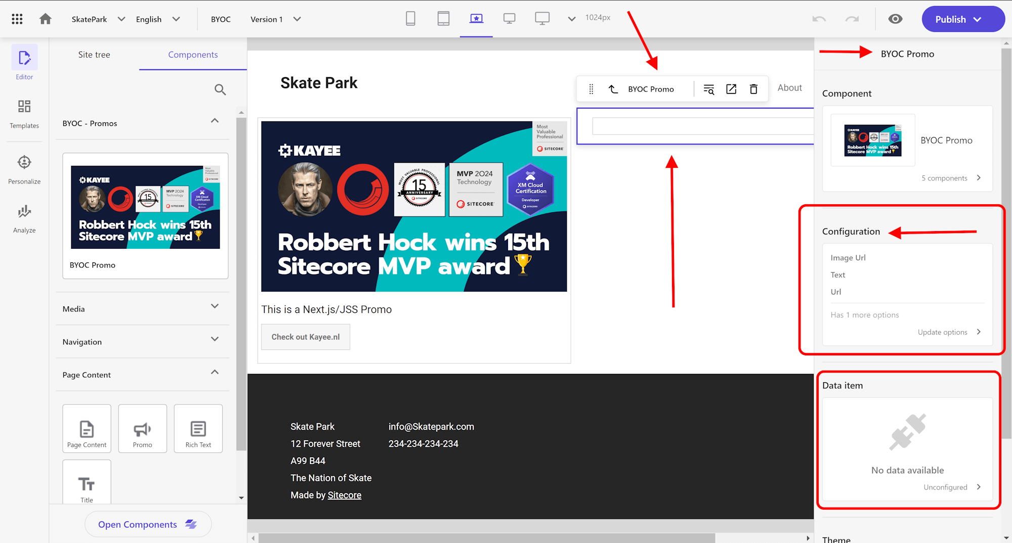
As you can see the ‘Byoc Promo’ component was added to the page, but it doesn’t show anything. That’s due to the fact that BYOC components doesn’t offer inline field editing directly on the page. On the right hand side you can either select the ‘Configuration block’ of the BYOC component or you can select the ‘Data item block’. In order to use the ‘Data item block’ you would need to first setup a template that has exactly the field names that are configured in the ByocPromo.tsx file. For this blogpost we’re going to focus on the ‘Configuration block’. So let’s select that.
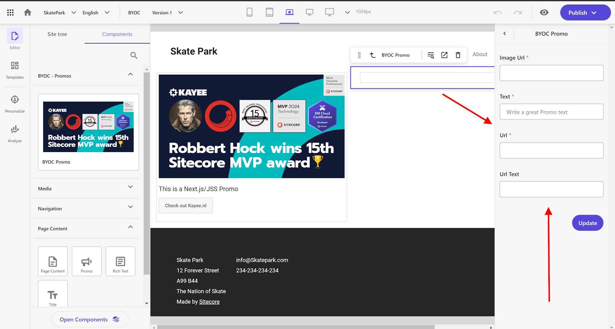
So now that we selected the ‘Configuration’ part, on the right hand side the fields that can be configured appear. Let’s configure them!
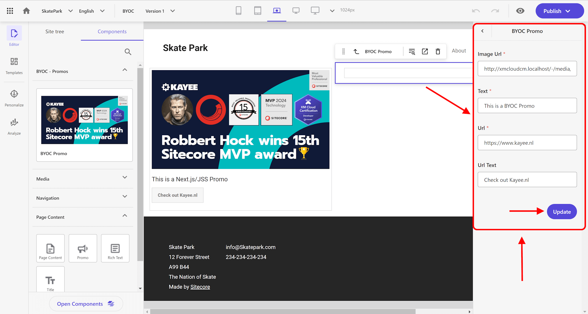
So now with the fields filled in we can click on the purple ‘Update’ button to actually let the component process and display the field values in the component.
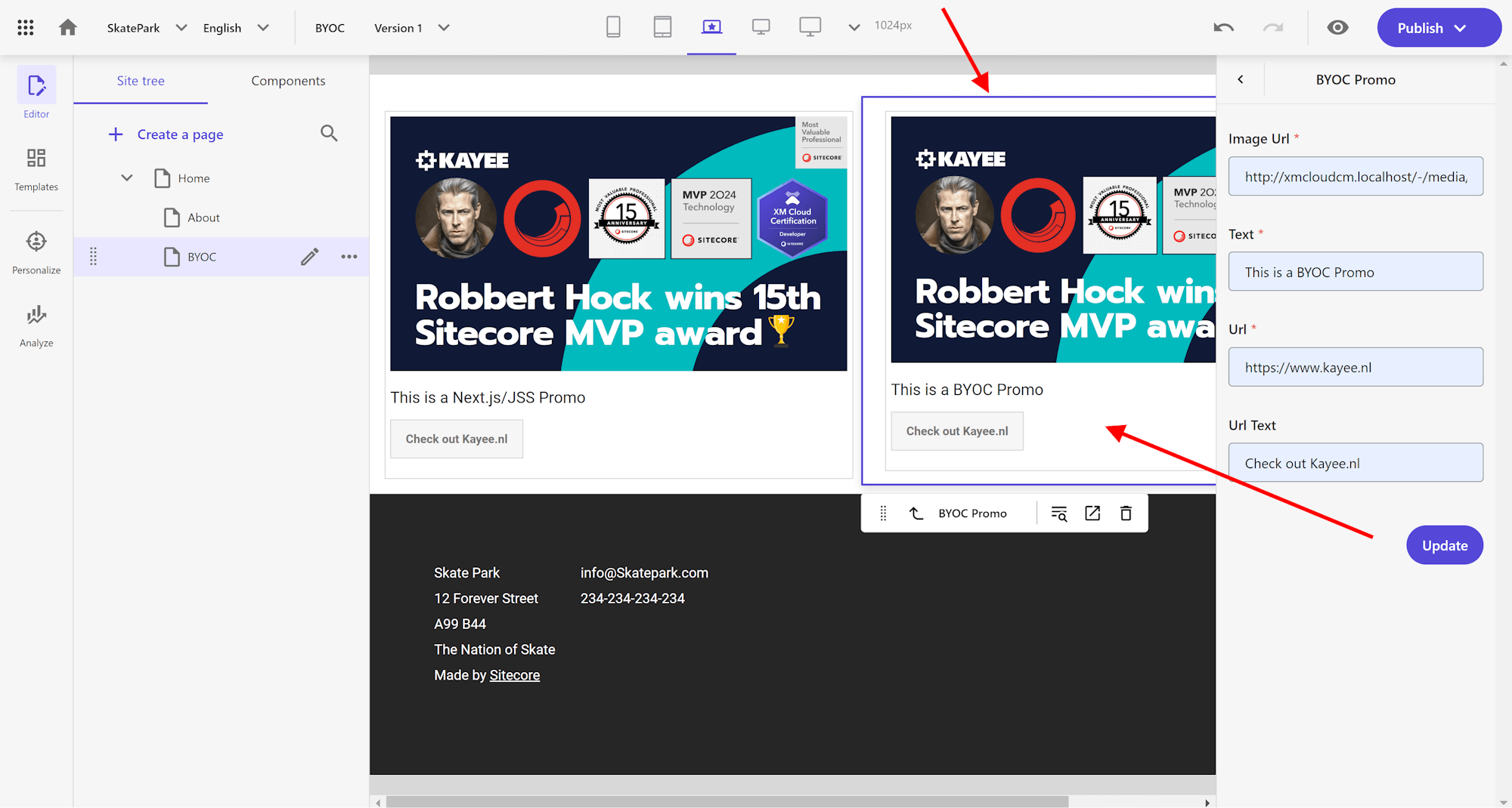
So as you can see in the end the component renders out exactly as the SXA Starter Promo component one. However all the styling options that are available to the Next.js/JSS component are not available to the BYOC component. You would have to implement all those options yourself through field configurations (which I will go through in a future blogpost).
Like the Next.js/JSS component you can also start using the optimized ‘next/image’ component from next.js, so BYOC components can be highly optimized.
Even though you won’t be able to see how the data gets stored for the component in Pages, we can go to the Content Editor and check out the presentation details for that component.
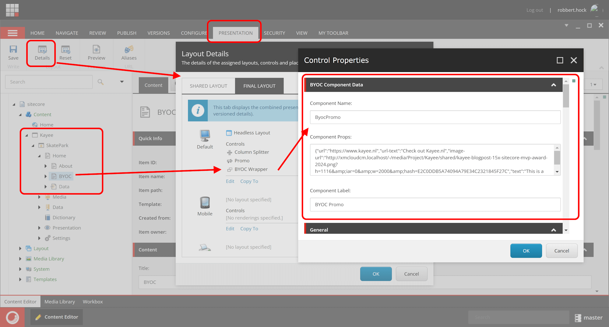
So as you can see in the ‘Component Props’ field, Sitecore stores the component data as JSON data.
And that’s it for now. Hope this blogpost gave you a great first look at ‘Bring your own components (BYOC)’ with Sitecore XM Cloud.
In a future blogpost I’ll go through some more advanced options to get the styling accordingly to how the SXA Starter kit is also offering them to allow for different variations of the Promo component
The code for the ByocPromo implementation can be found here in this repo: https://github.com/KayeeNL/kayee-xmcloud-byoc-demo
Happy Sitecore-ing!
–Robbert