I went a little bit on a deep-dive here to investigate what icons we have available and where they are coming from when styling components in the Pages editor in Sitecore XM Cloud. For this blogpost I assume that you’re running either on XM Cloud itself or running a local instance that is using the xmcloud-foundation-head as a base for your repo.
When opening a page in Pages, the WYSIWYG (What You See Is What You Get) editor in Sitecore XM Cloud, we can select a component (in this case an image component) and see its properties.
As you can see some styling parameters show certain icons to give you a visual way of configuring certain styles for the given component.
In pages we can see that the following CSS file is loaded:
When we open up that css file, we can see that a particular .svg file is loaded: see the url(SPD.f3b6a8ed6ad62ca5.svg?62vhim#SPD) element.
When we then download this .svg file at:
Then we can see that Sitecore used a tool called IcoMoon for constructing the svg that is used for the icons in the Pages editor.
IcoMoon is a web-based application that allows you to create and customize icon sets, particularly for web and app development. It provides a user-friendly interface for selecting, customizing, and generating icon fonts or SVG sprites. Icon fonts are collections of symbols or icons represented as font characters, making it easy to use them in web projects by applying font styles. With IcoMoon, users can choose from a library of existing icons or upload their own SVG files to create a personalized icon set.
The SVG file is made up of glyphs. Glyphs are often used to depict icons, symbols, or characters with intricate details. Unlike traditional image formats, SVG glyphs are resolution-independent and can be scaled without loss of quality, making them ideal for creating crisp and responsive visual elements on the web.
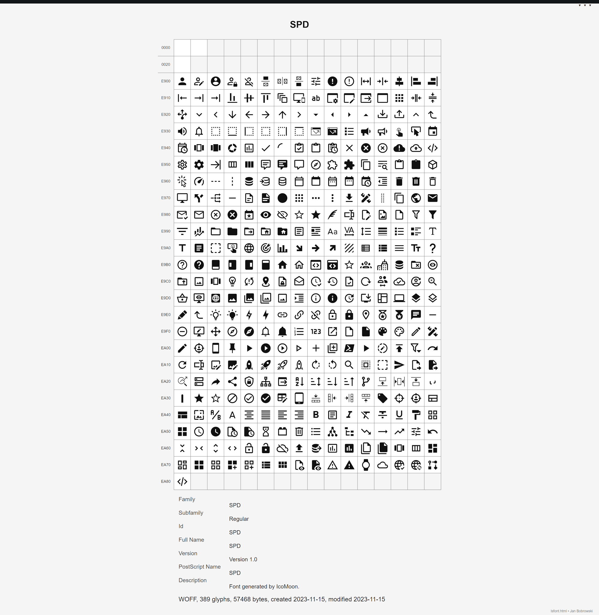
So here’s the overall image of all the icons in that SVG file (done through loading the .woff file through this website):
These icons correspond to a particular CSS class, which you can use while setting up your Style items underneath /Presentation/Styles in your Sitecore Headless Site. Here are all the CSS classes:
See my Gist at GitHub: ‘Available css classes for icons in Sitecore XM Cloud Pages’.
So in Sitecore, some styles do and some styles don’t use this icon (depending how they are displayed in the Pages editor). Spacing however uses these css classes and here the CSS class is configured like this:
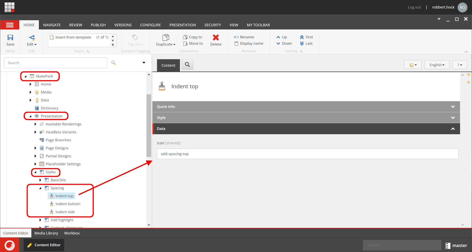
So the Pages CSS classes will be configured in the ‘Icon field’ (not to mix up with the Style Section ‘Value field’).
So for Spacing the following CSS classes will be configured in the ‘Icon field’:
- Indent top -> add-spacing-top
- Indent bottom -> add-spacing-bottom
- Indent side -> add-spacing-sides
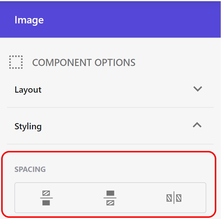
This will correspond with the following icons in the .SVG file:

And this is how they’ll show up in the Pages Editor:
And that’s about it. Have a look at all the icons and their corresponding CSS classes that are available and start constructing the parameters so that they are Pages editor friendly.
Happy Sitecore-ing!
–Robbert
